Inspired by disruption
The idea for this project began when I spent the 2020 spring COVID quarantine re-building a fence on my parents’ farm. I grew up on that small multi-generational livestock farm, and in my time of work and isolation, I couldn’t shake the idea of making a guide to doing the kind of work that at this point I could do blindfolded.
I earnestly began working on The Art of Fence Building when I stumbled across an old booklet that immediately captivated me. I found The Old Farmer’s Almanac in a thrift shop and I knew that I was making a booklet.
As my itch to make something became unbearable, I laid out a list of goals for the project
1. This project was to be aimed at the novice, youngish “homesteader” types.
2. The product must be accessible.
3. A cohesive visual style will be deployed throughout, in drawings, diagrams, and typography.
4. The mood of the project will reflect a “Farming” visual culture, while avoiding faux country.
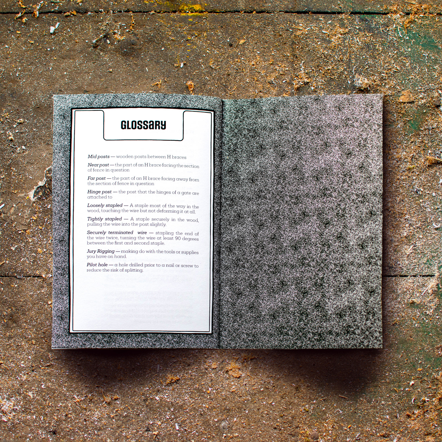
The Passion Project
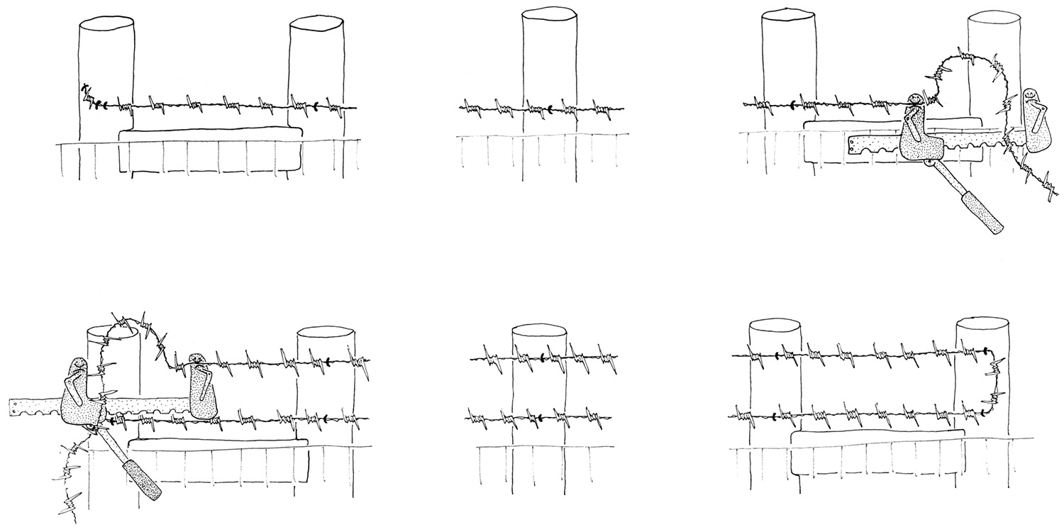
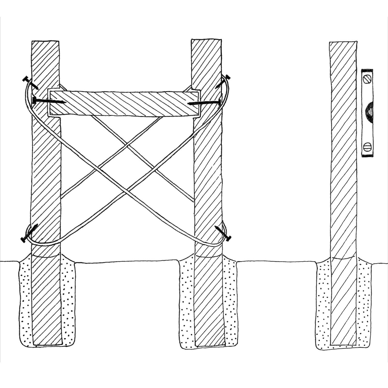
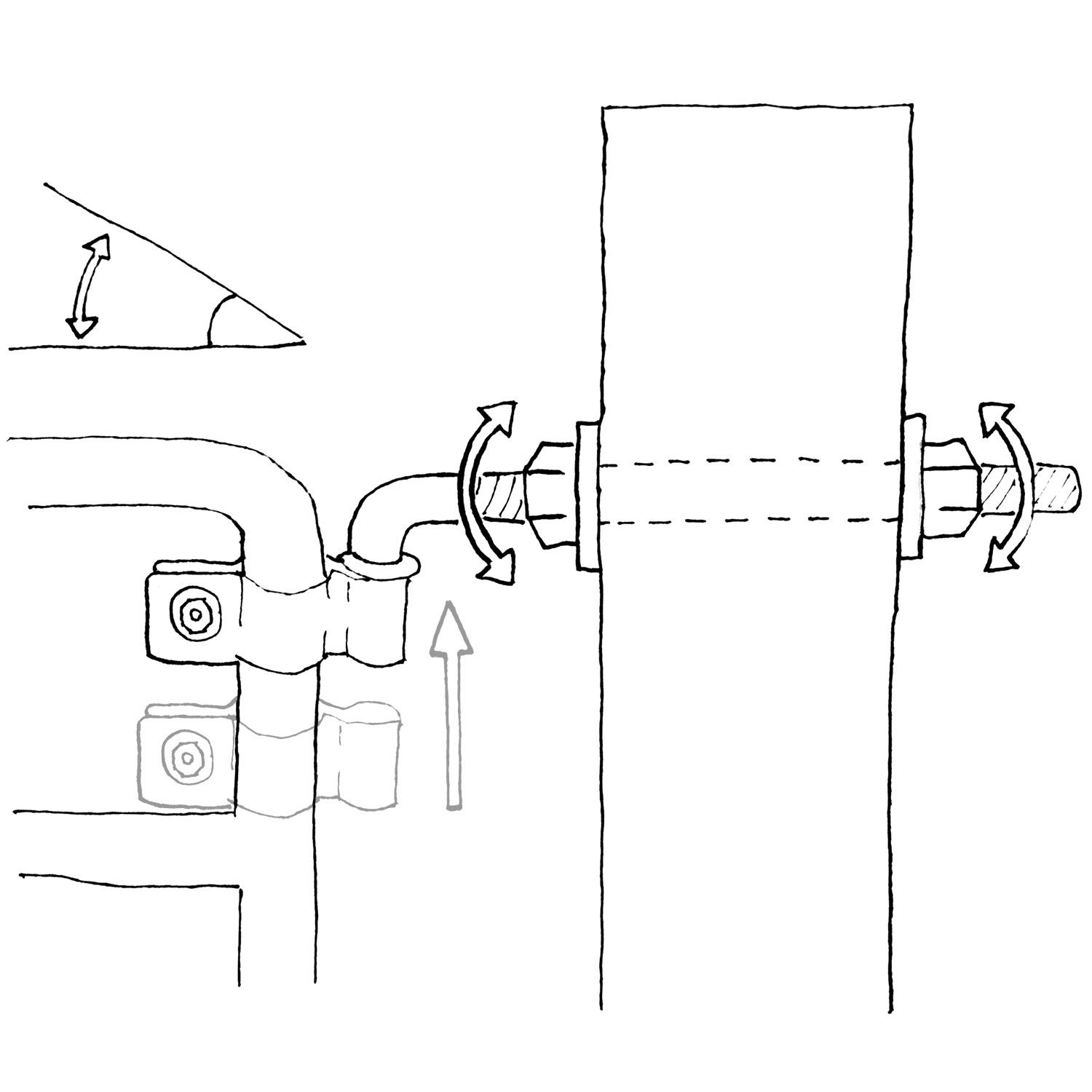
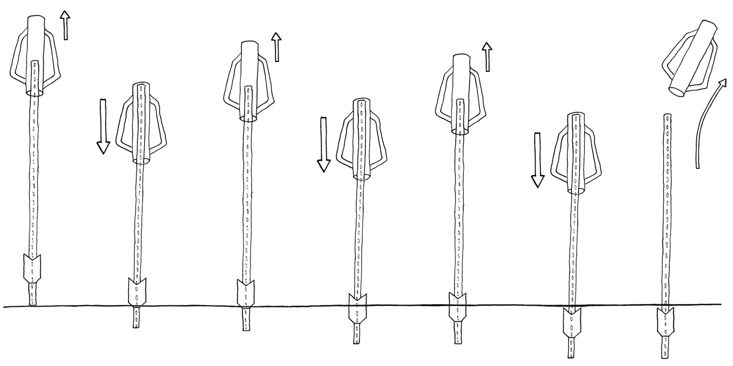
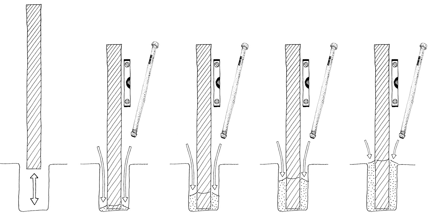
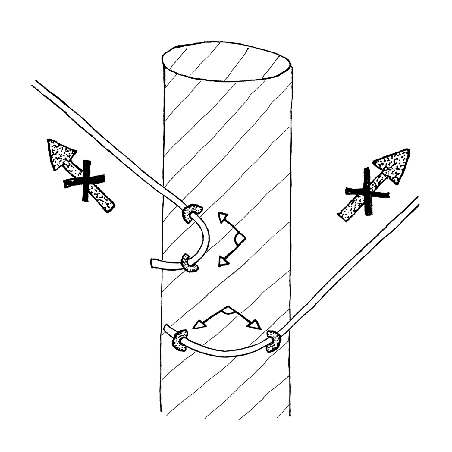
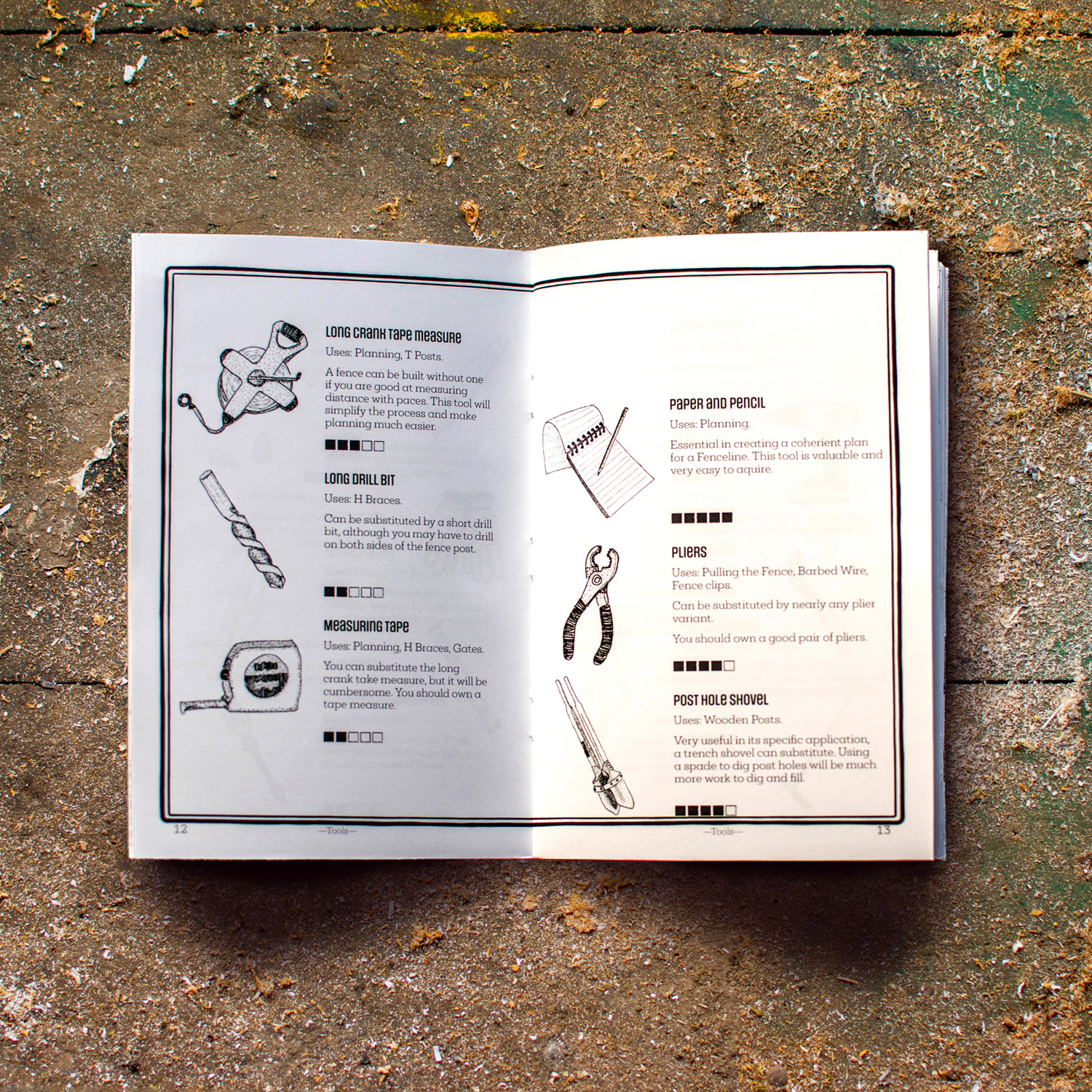
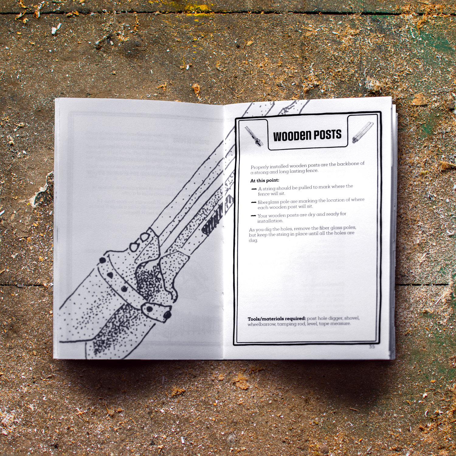
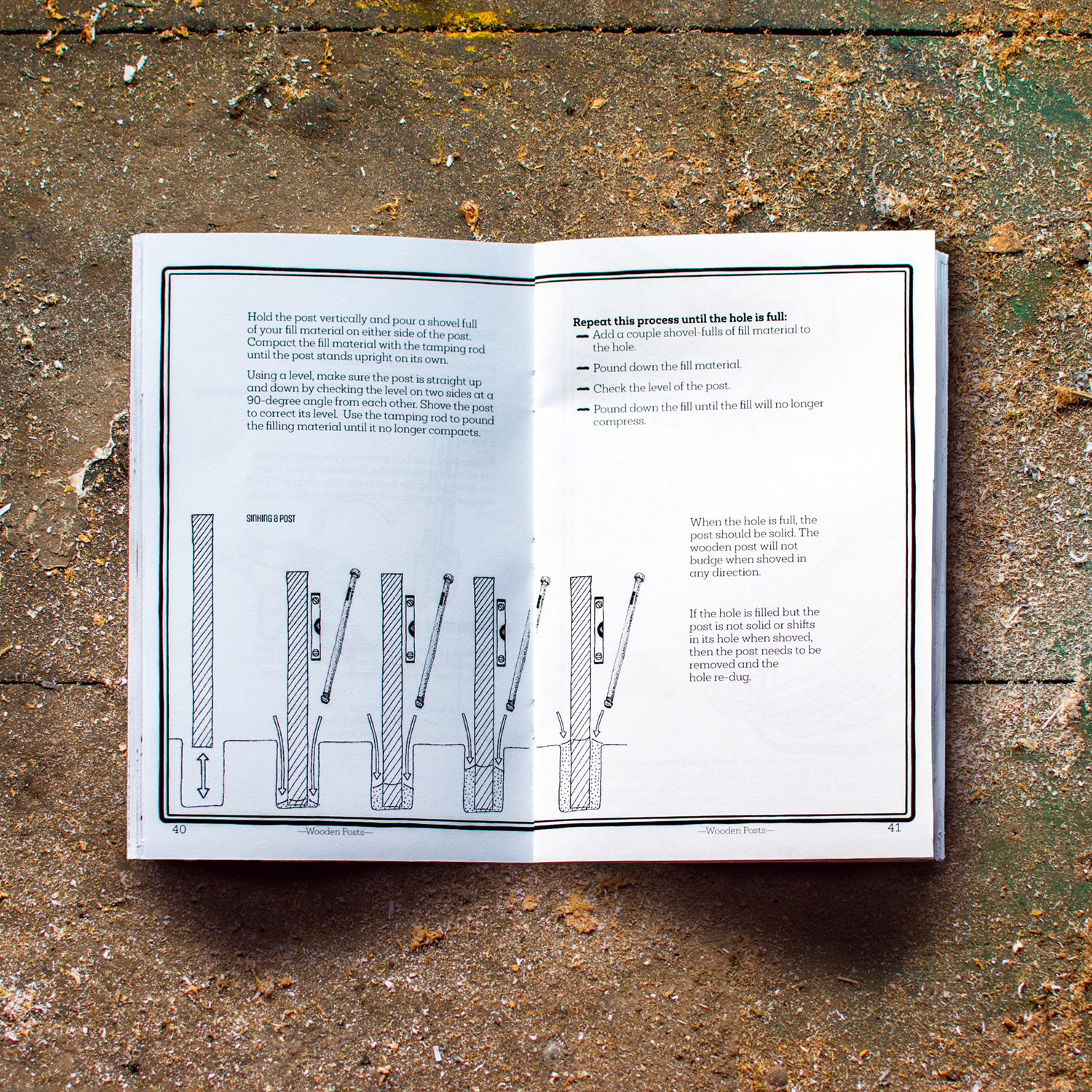
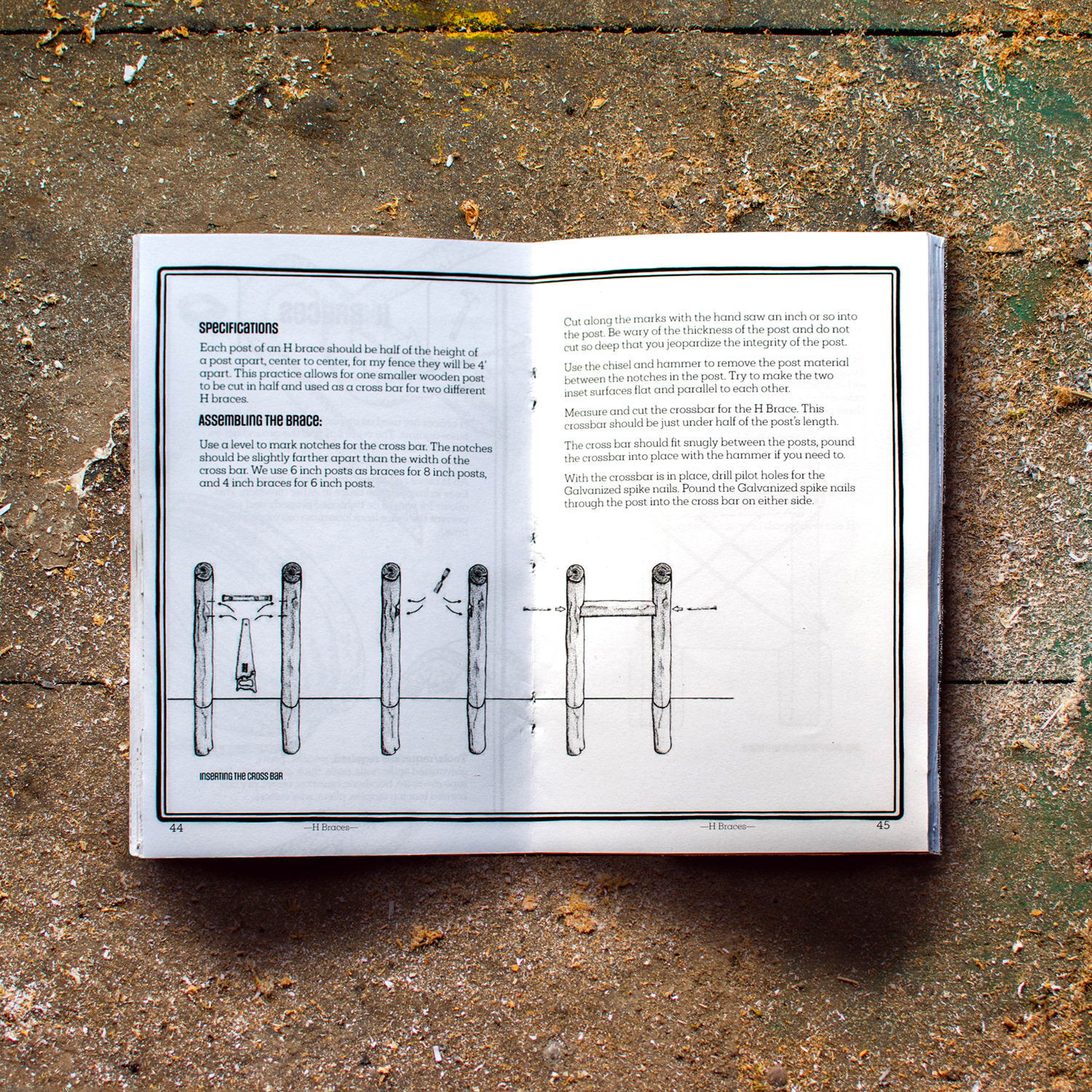
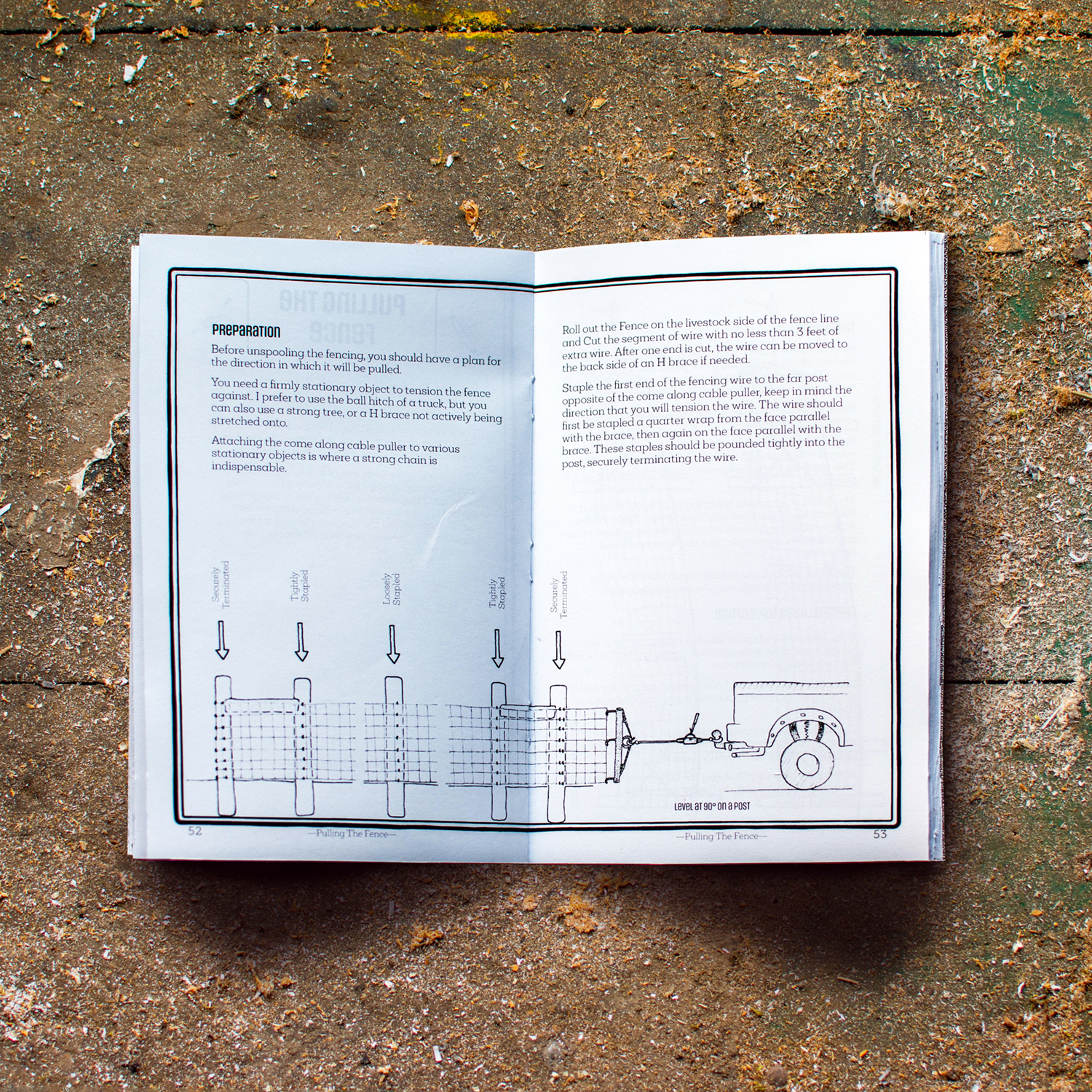
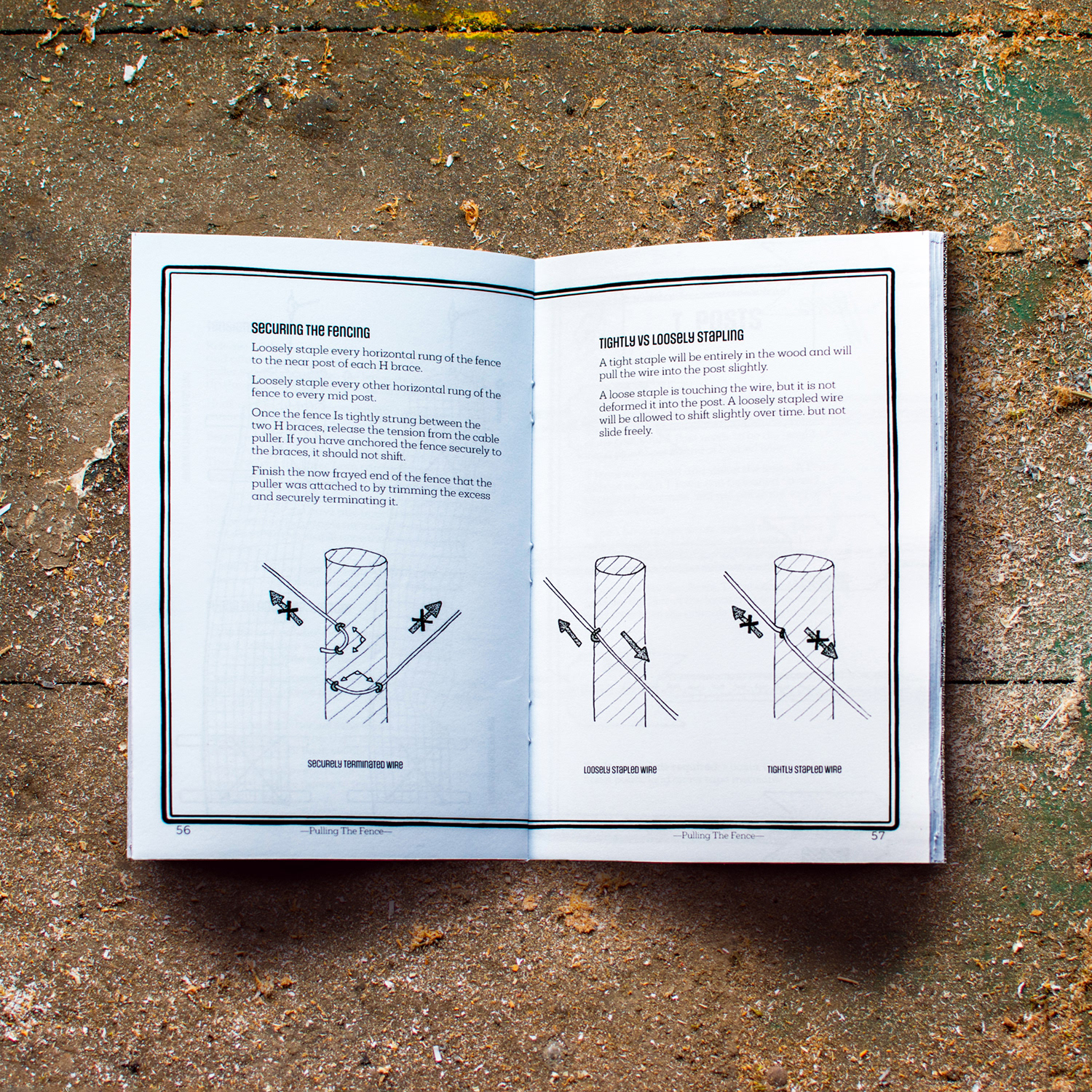
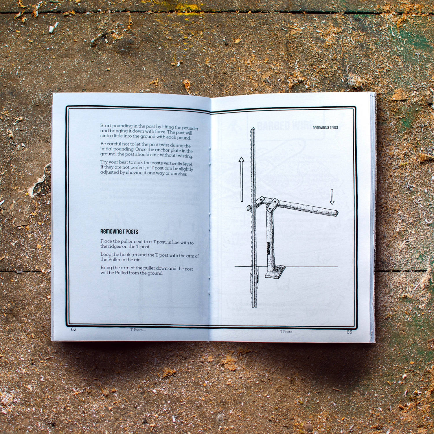
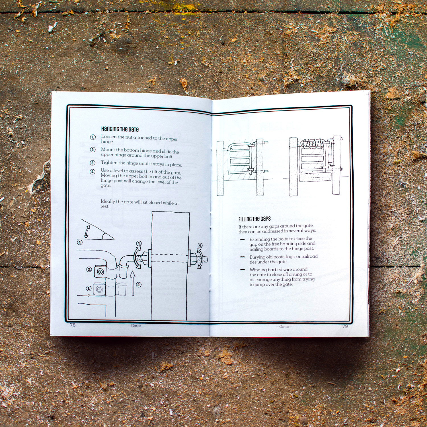
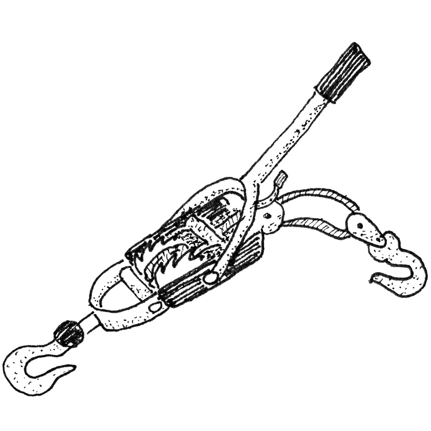
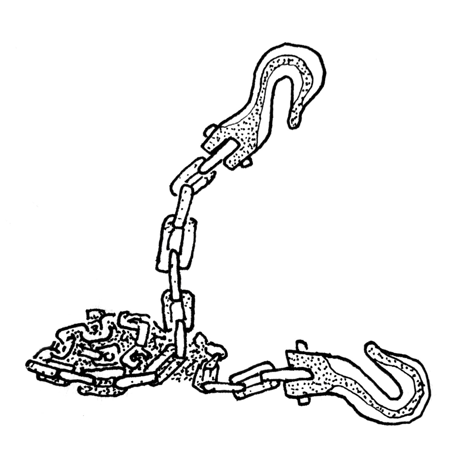
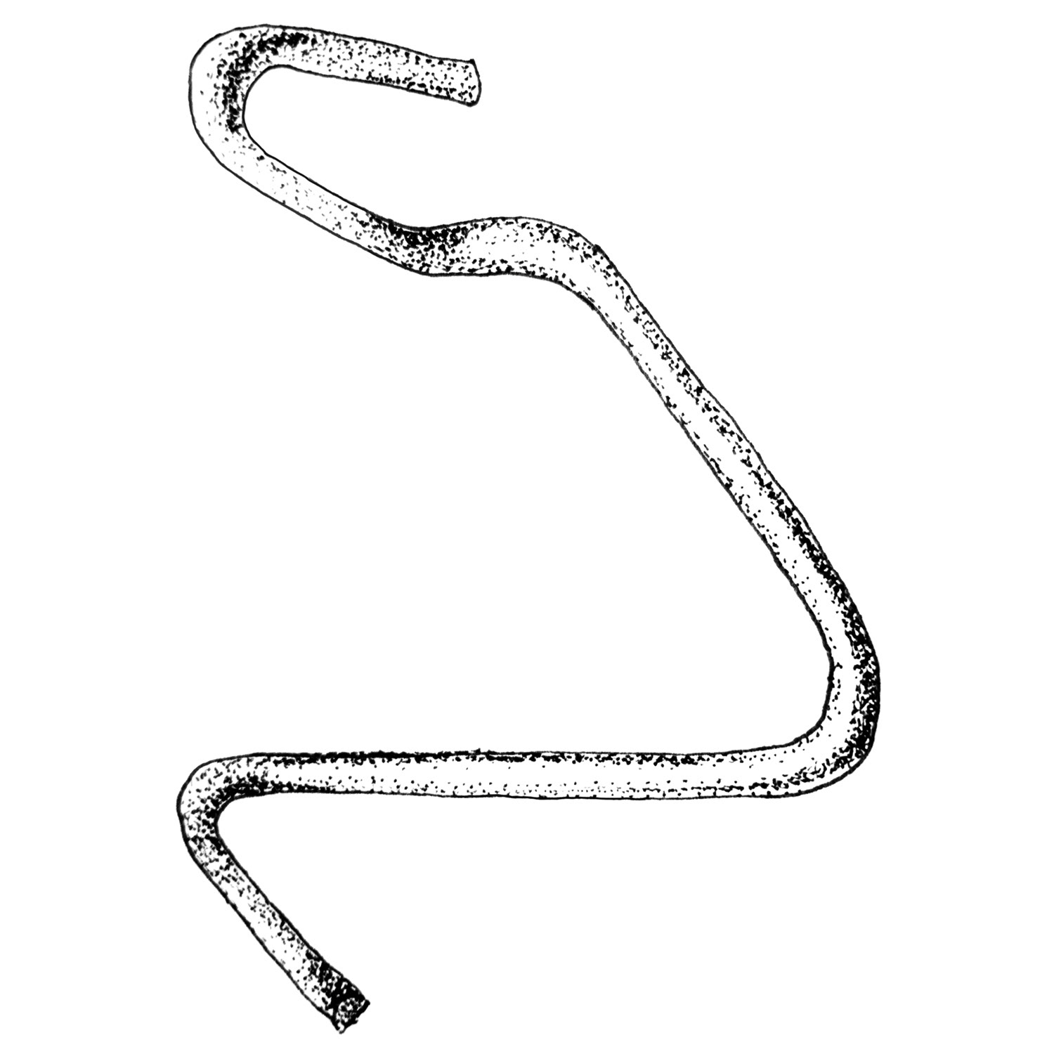
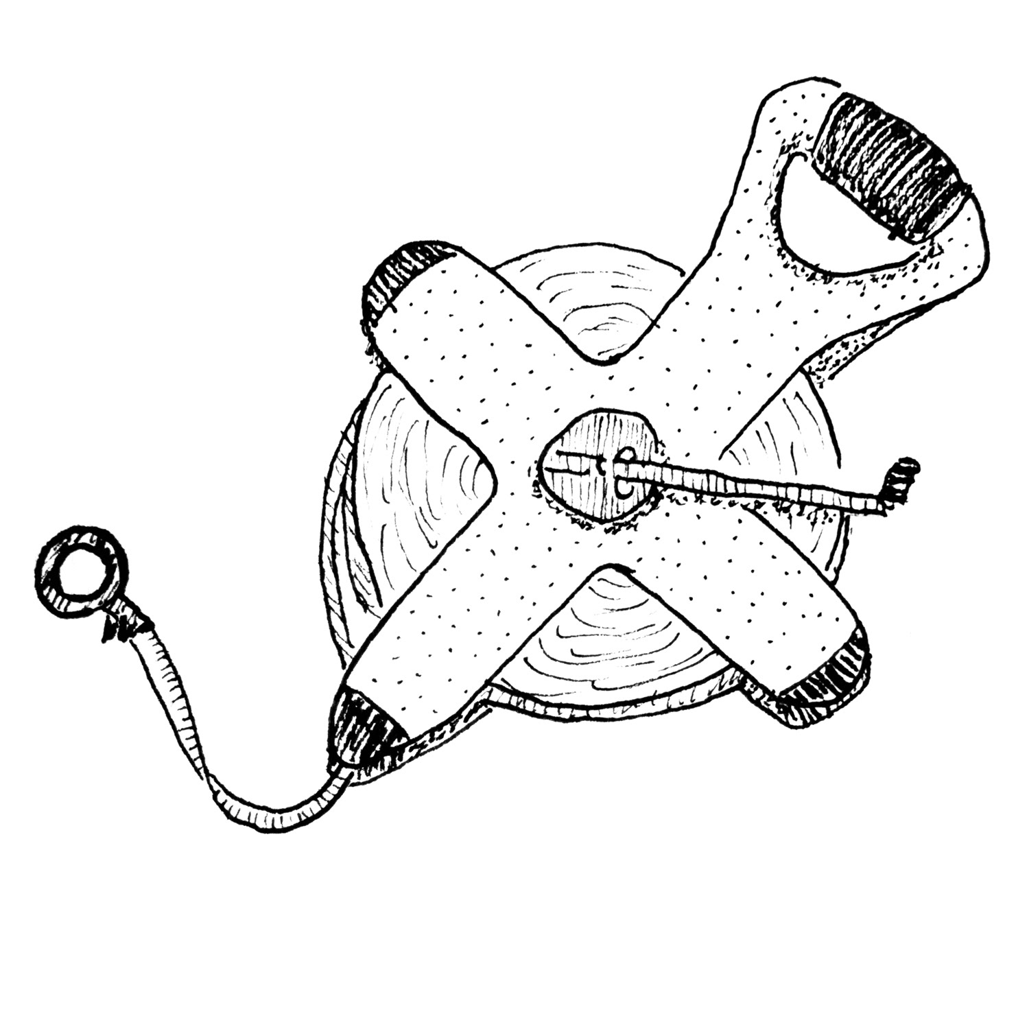
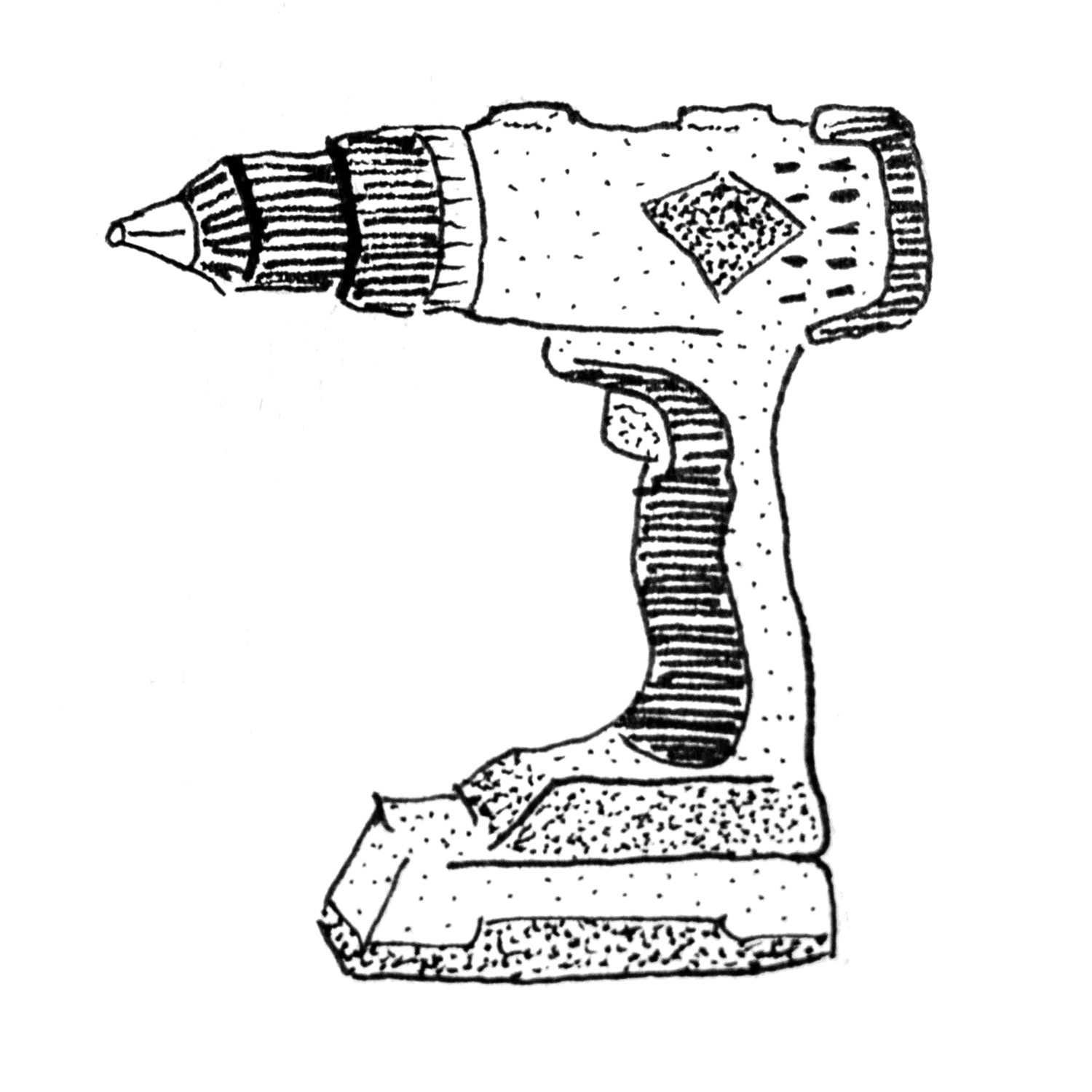
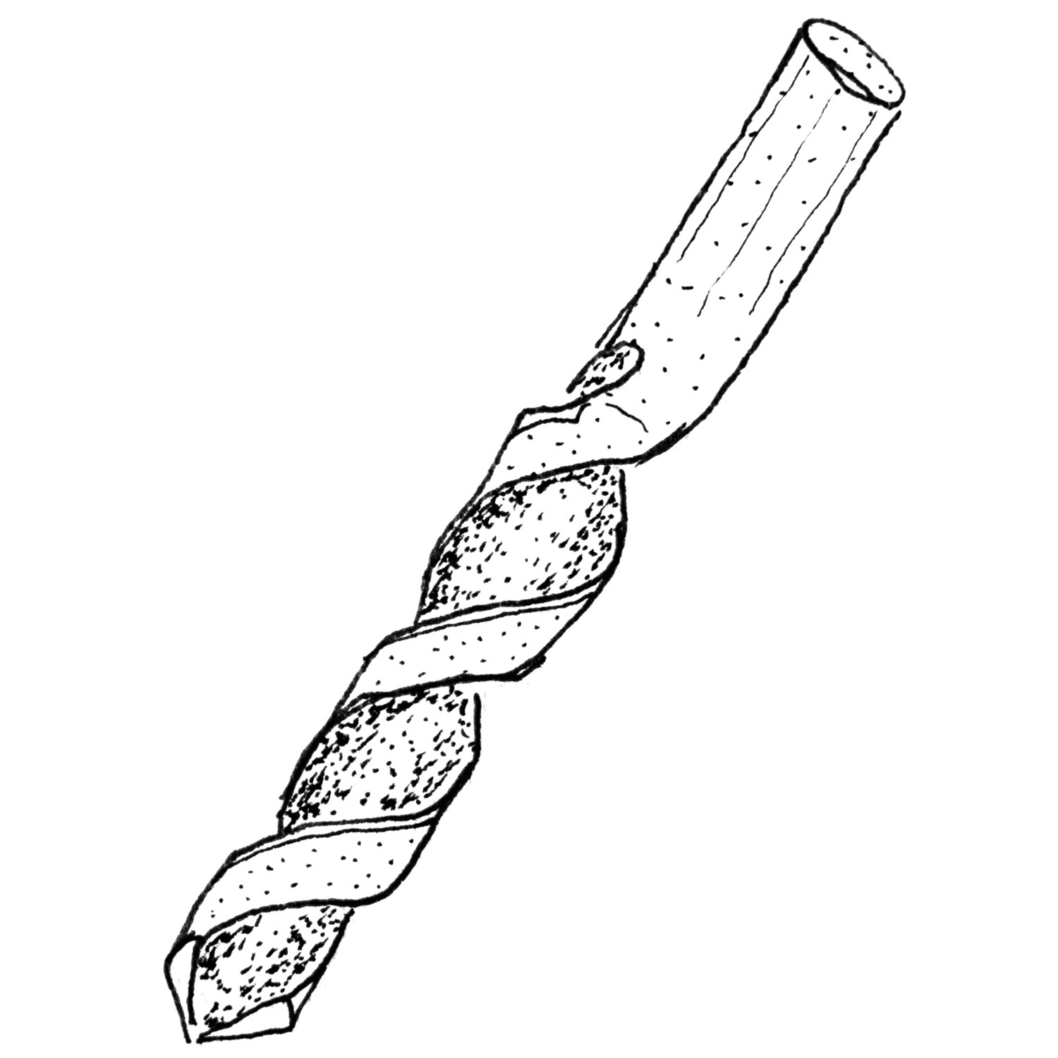
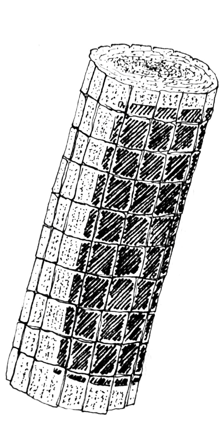
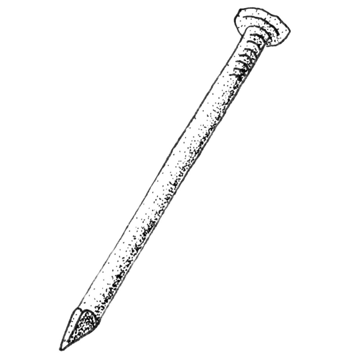
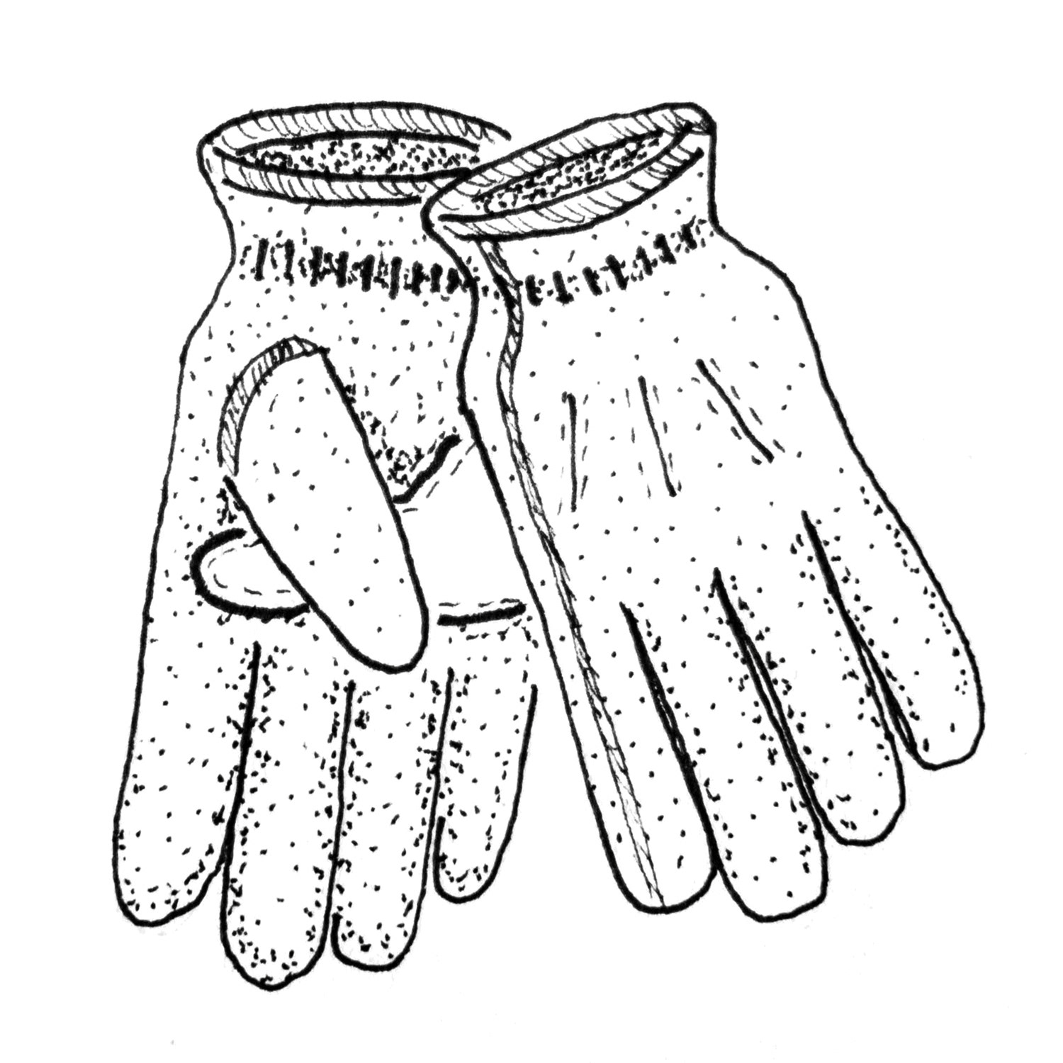
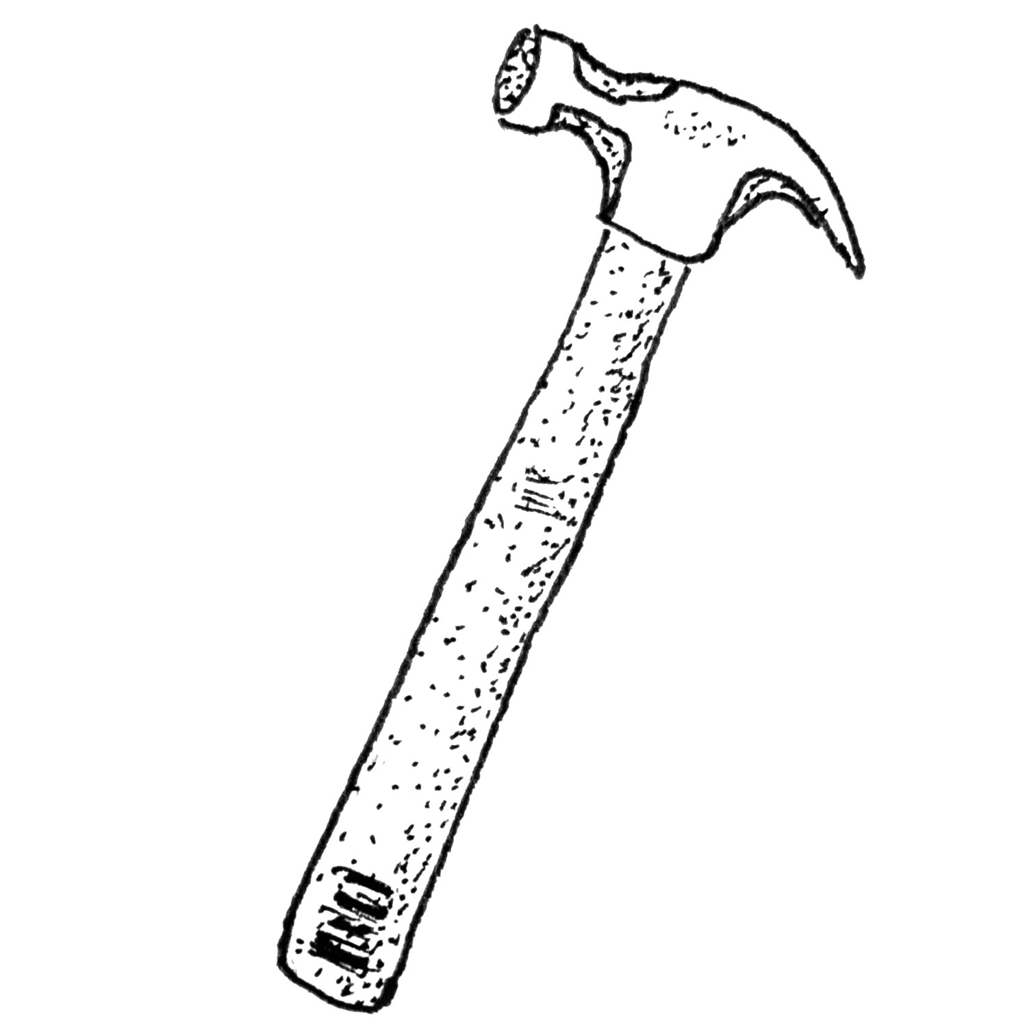
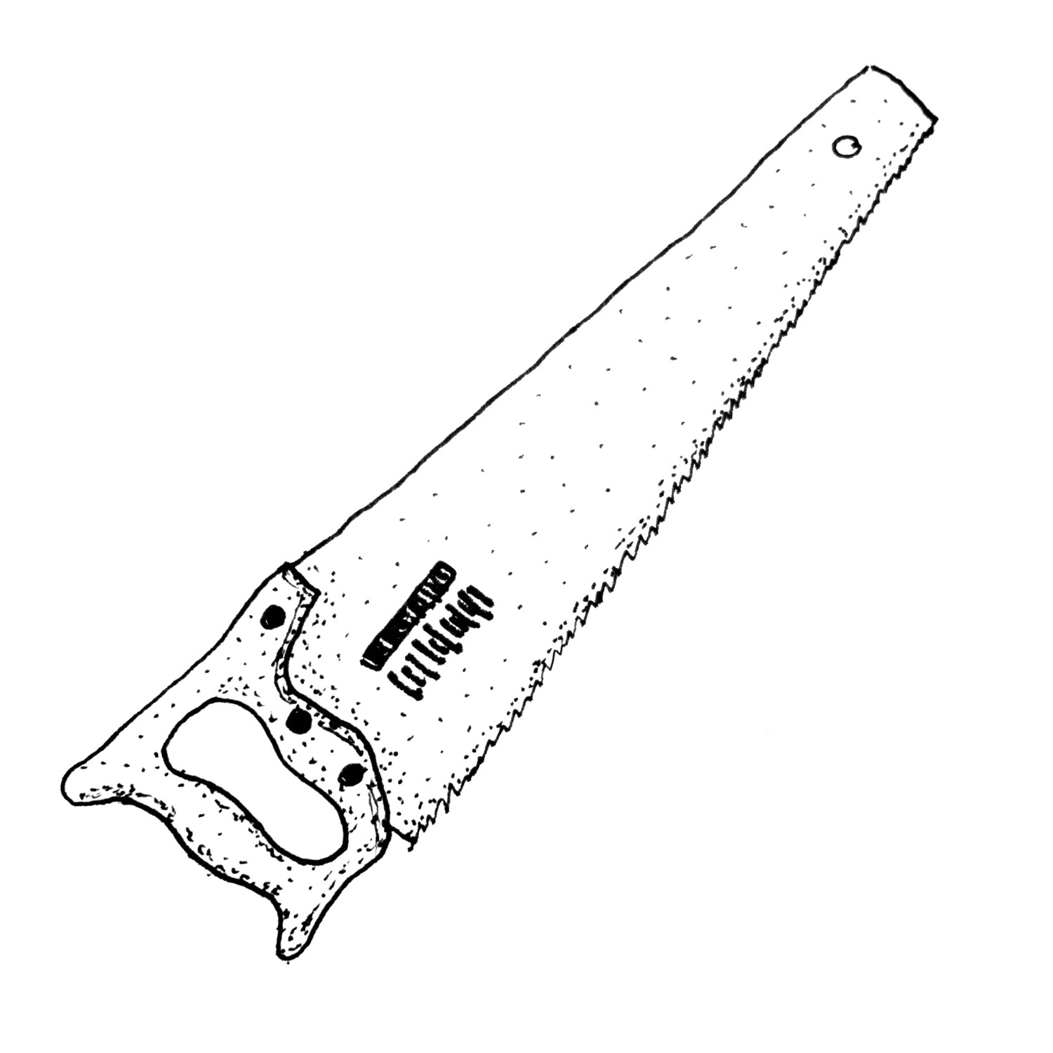
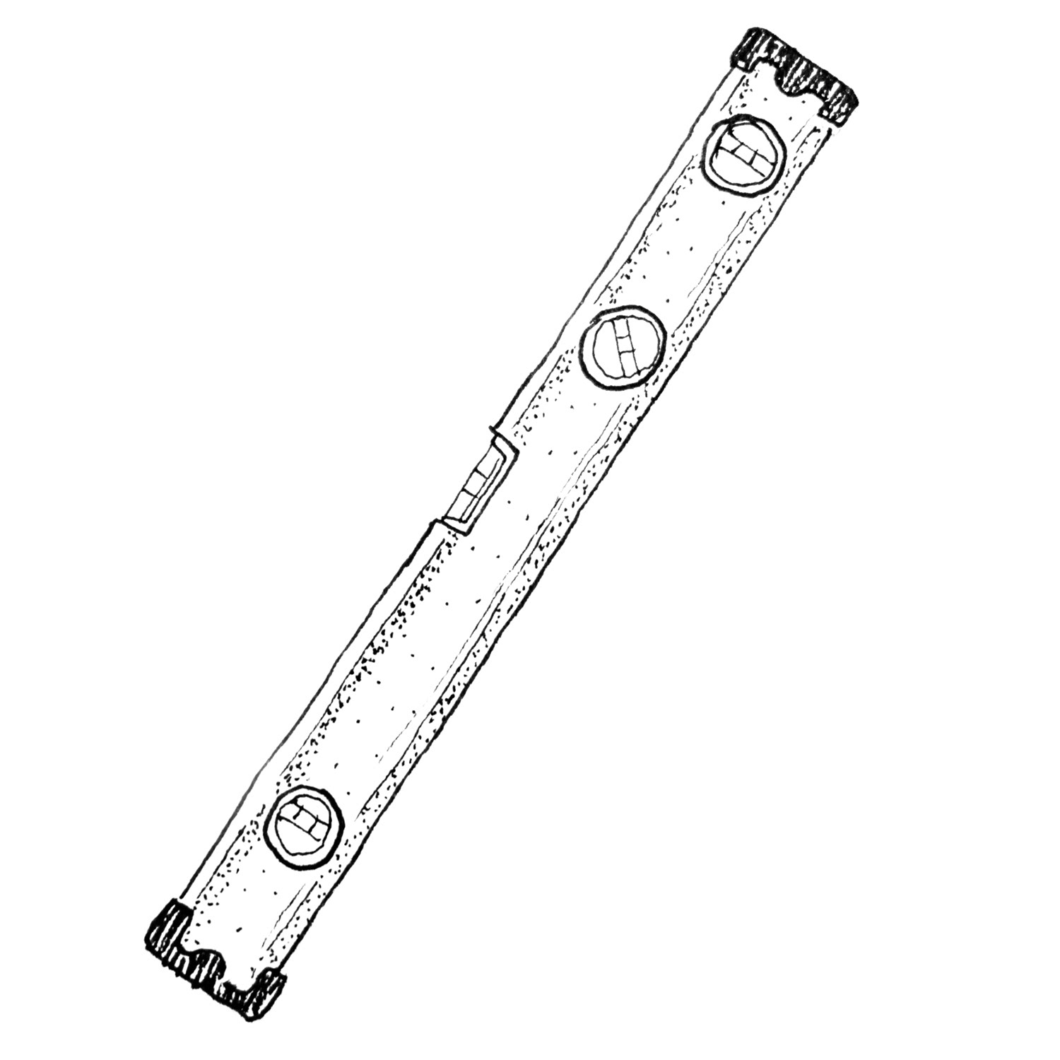
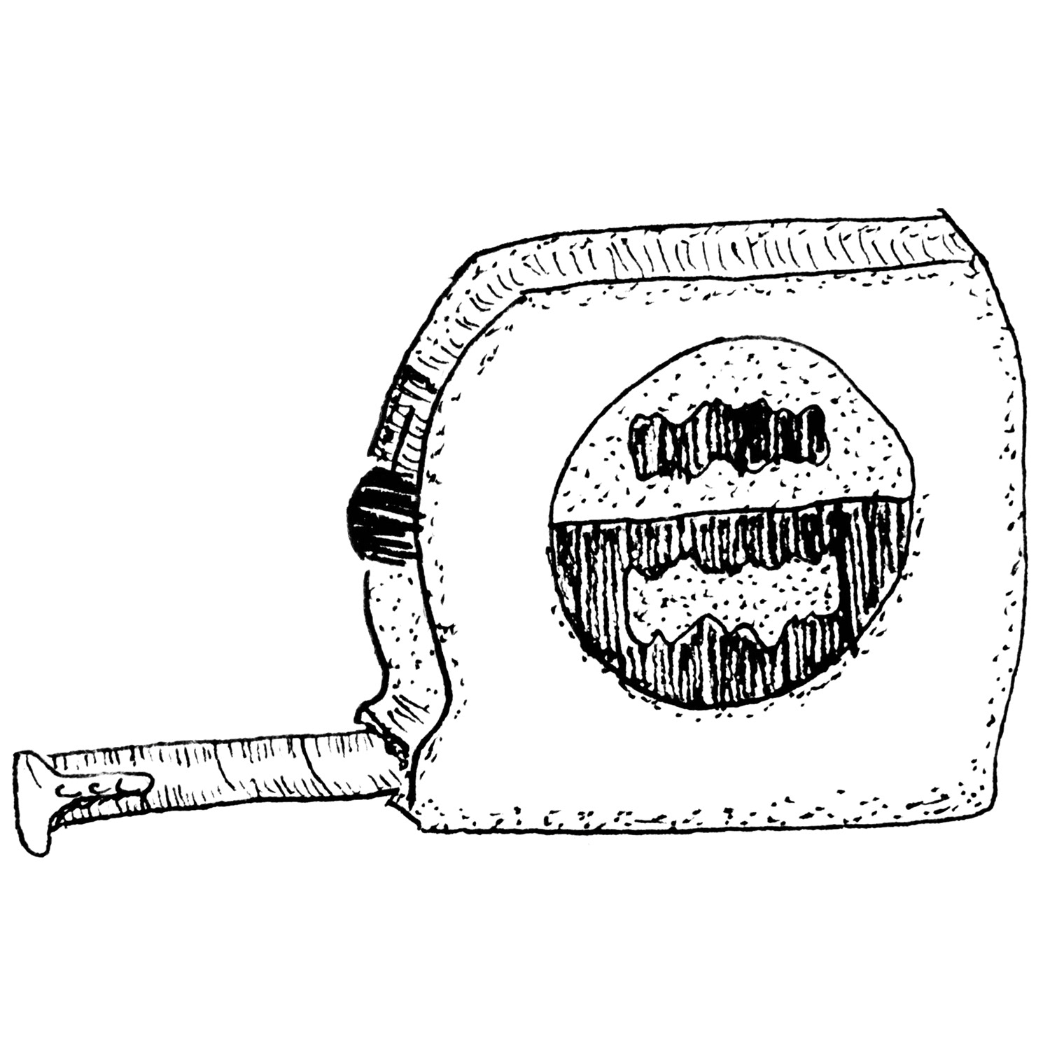
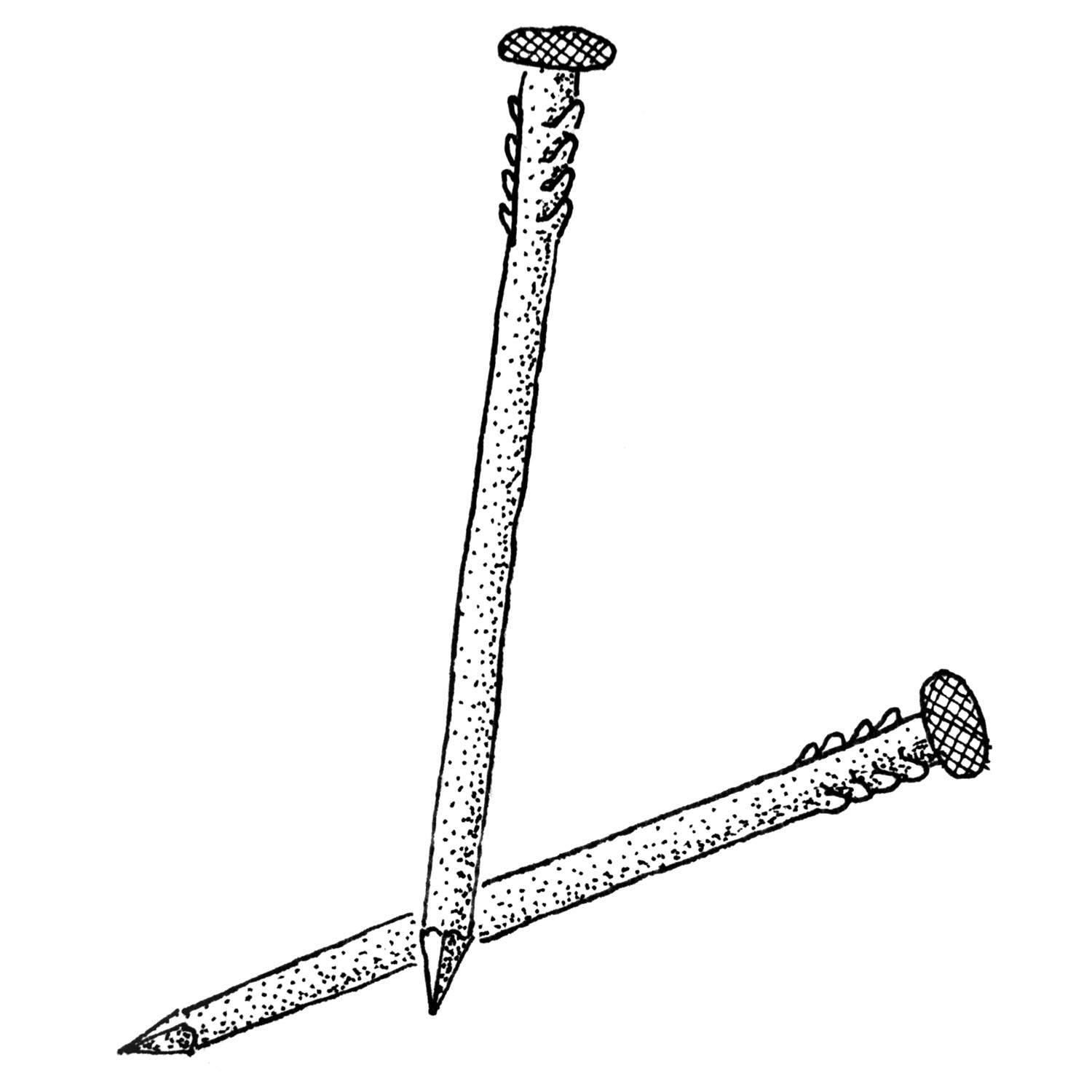
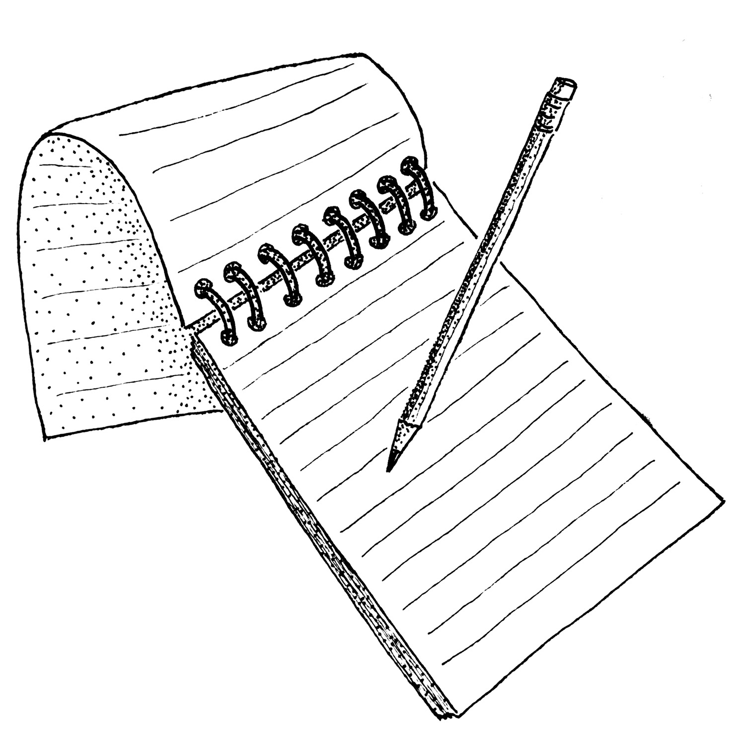
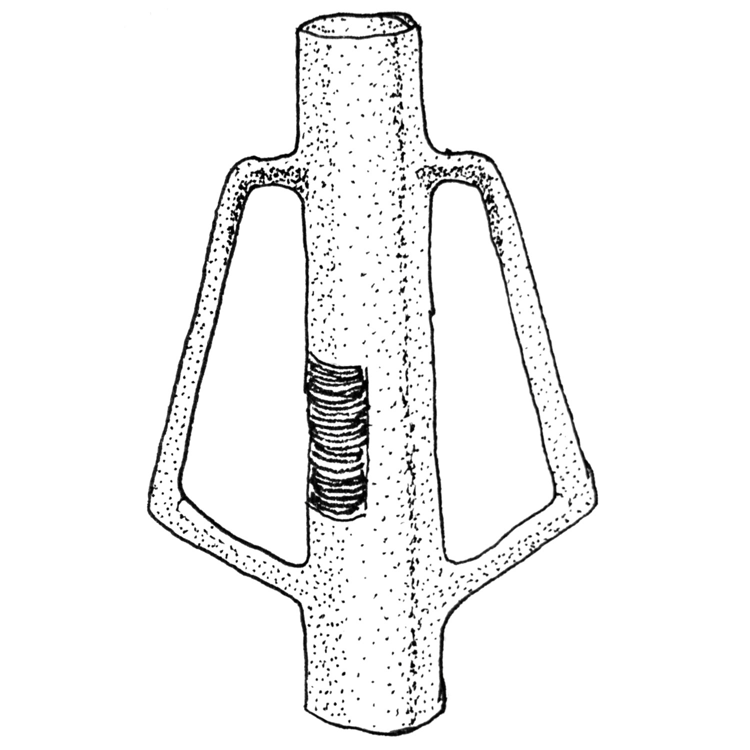
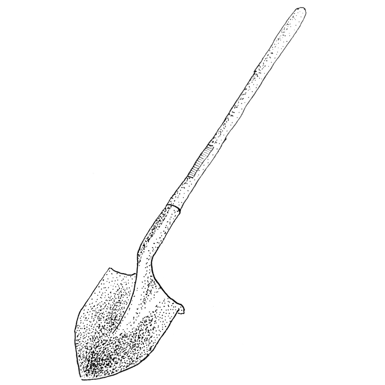
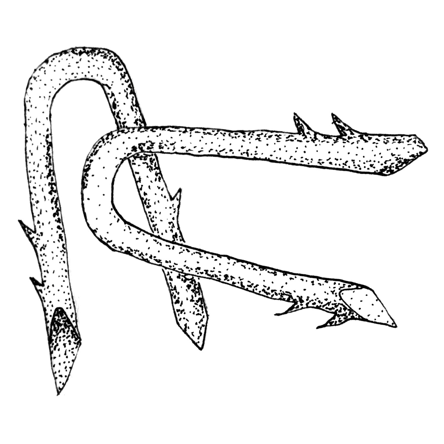
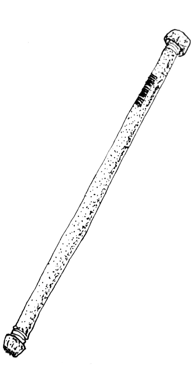
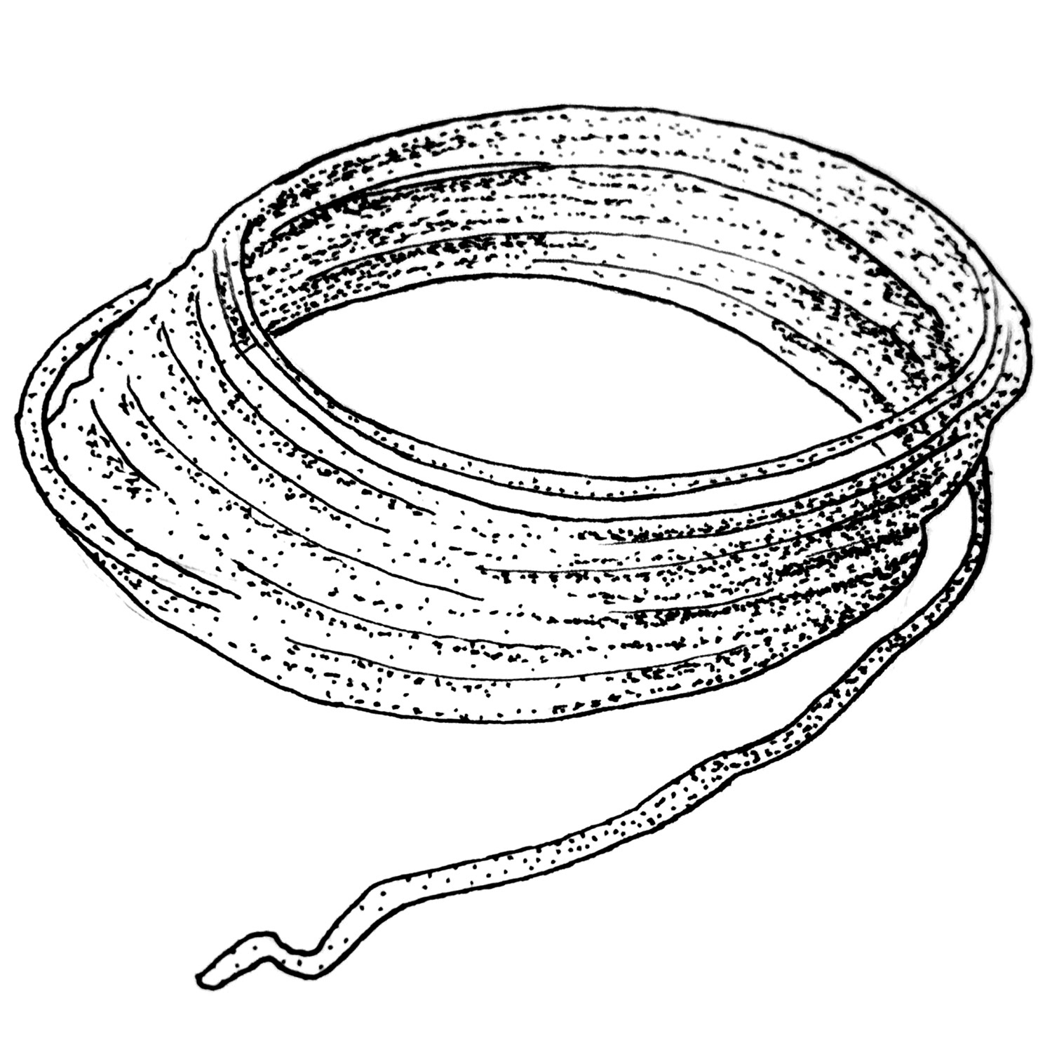
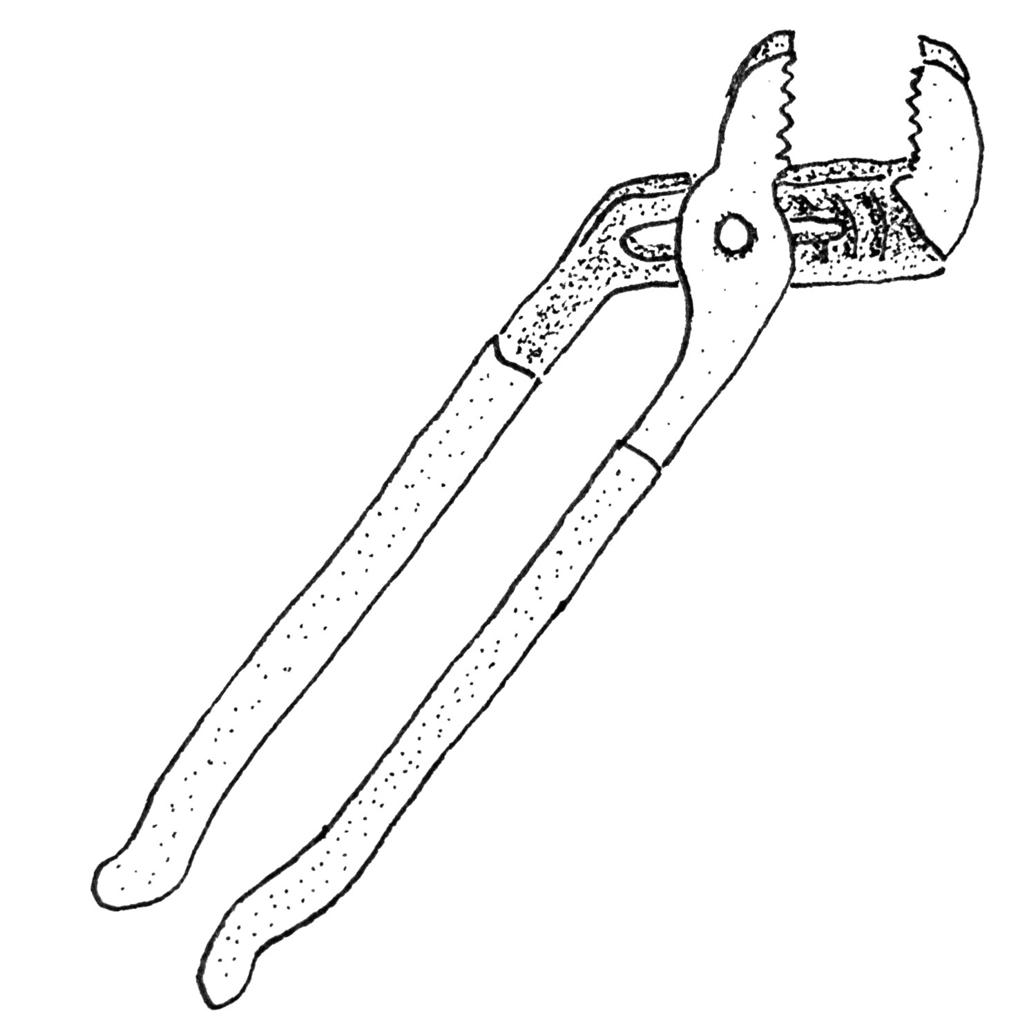
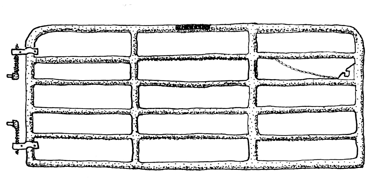
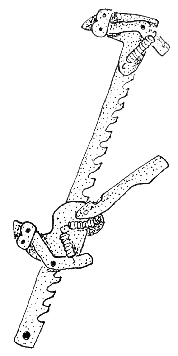
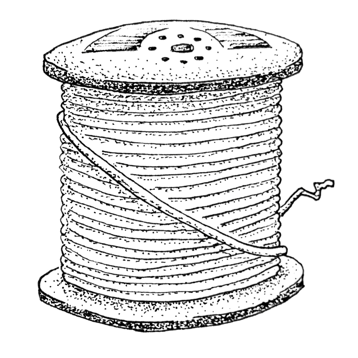
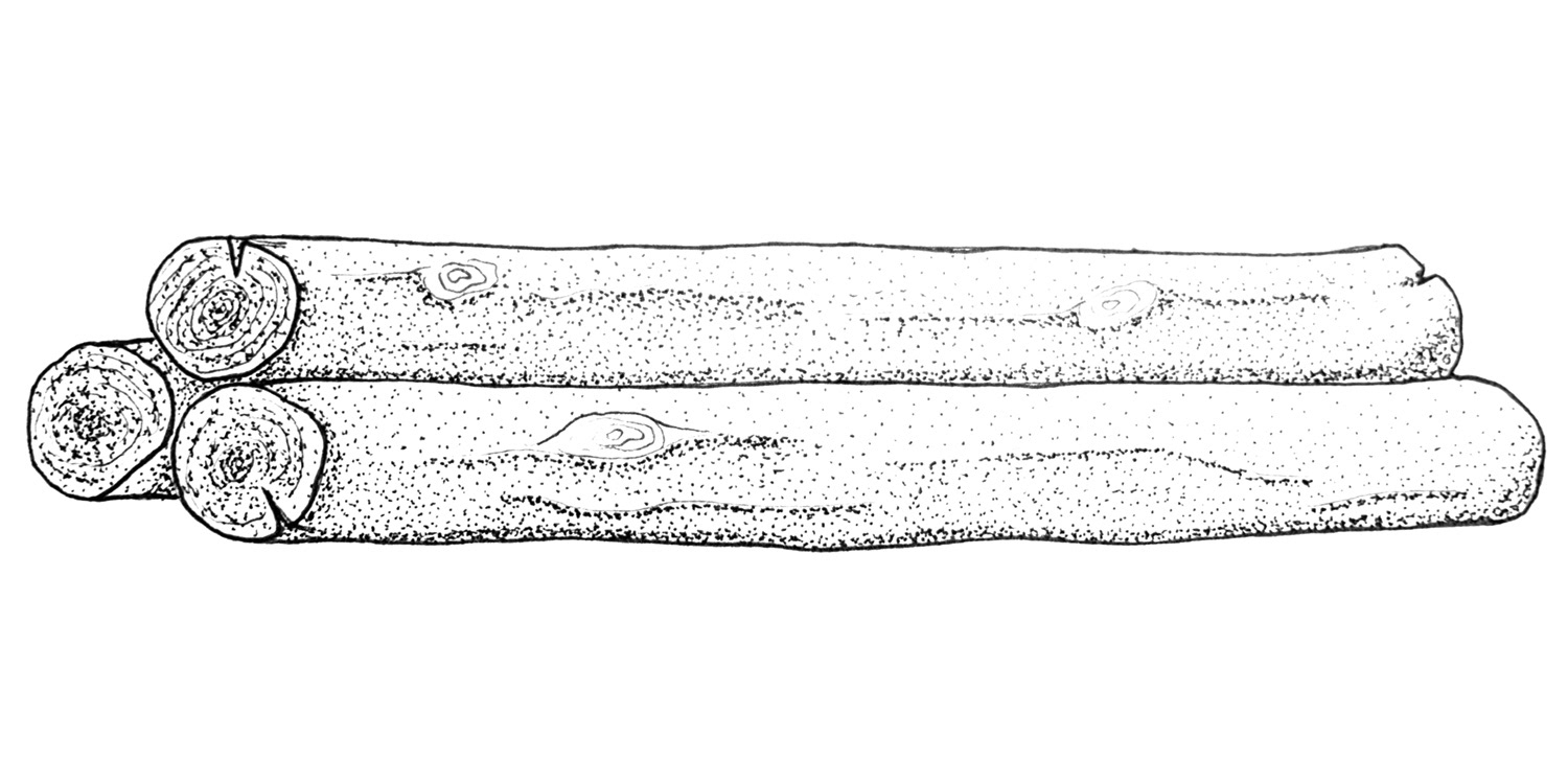
With a vision in mind I assembled a mood board of both physical and digital samples. I started by making simple ink on paper sketches of basic tools used in fence construction, and by the time I started drawing the diagrams a style had solidified. I chose a simplified reduced perspective linework with stippling for ornamentation when appropriate. While writing the copy I found the natural chapter breaks and identified when and where I needed a diagram or illustration.
With a defined style and list of needed elements I illustrated the nearly 100 hand drawn elements needed for the project. I photographed my illustrations and diagrams, cleaned them up in photoshop, and linked the files to my InDesign document, where I formatted the copy and additional visual elements. I printed the booklet and hand bound it with a simple saddle stitch.
The booklet went through two iterations where it was printed and reviewed by both armatures and experts in fence building to proof accuracy and understandability.
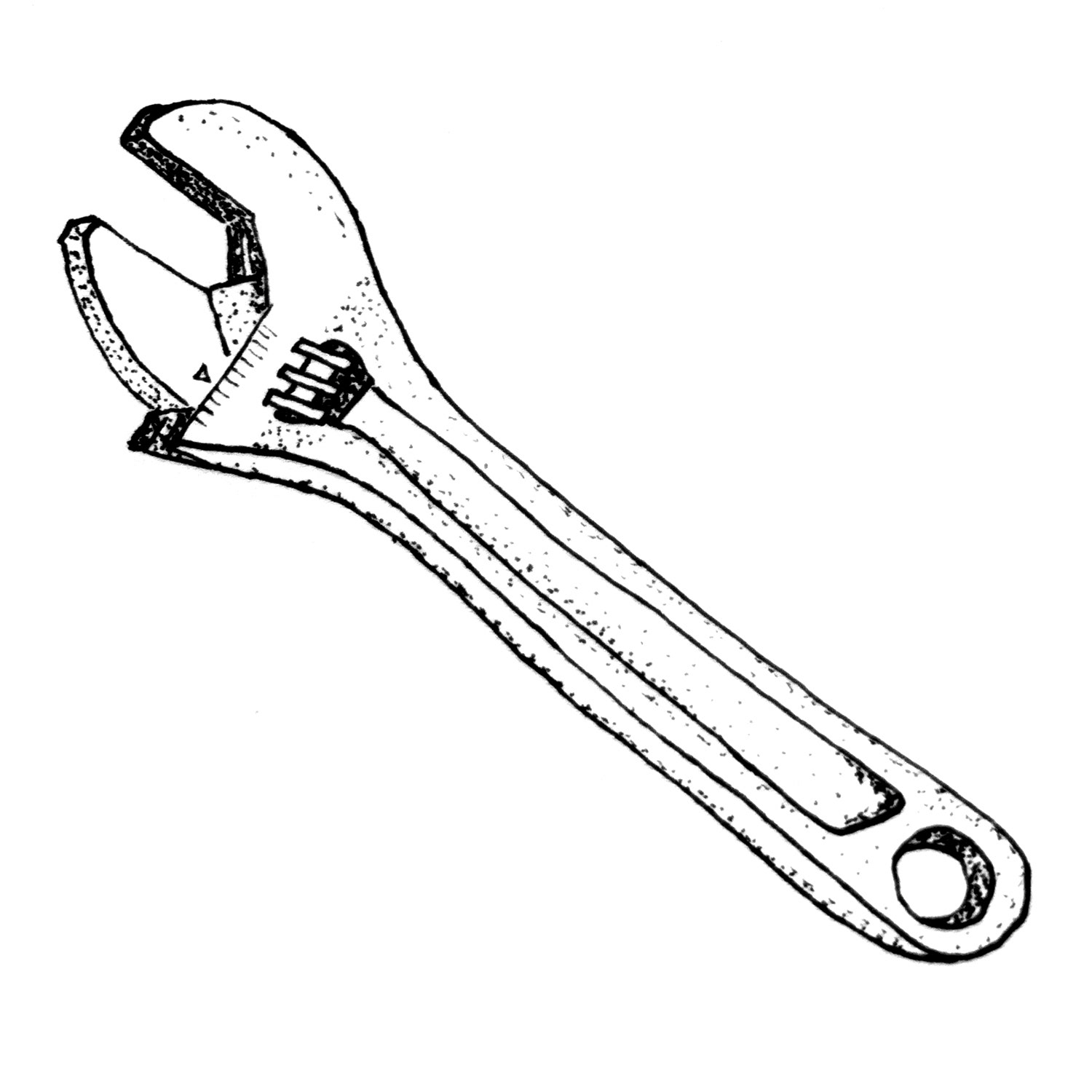
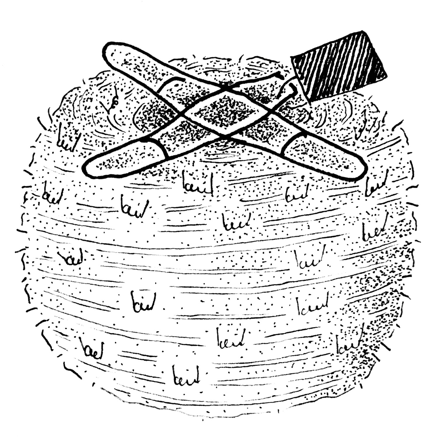
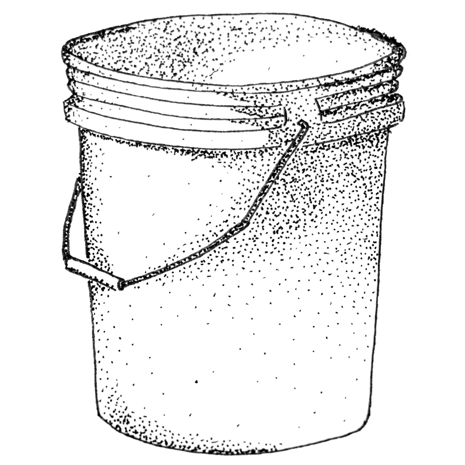
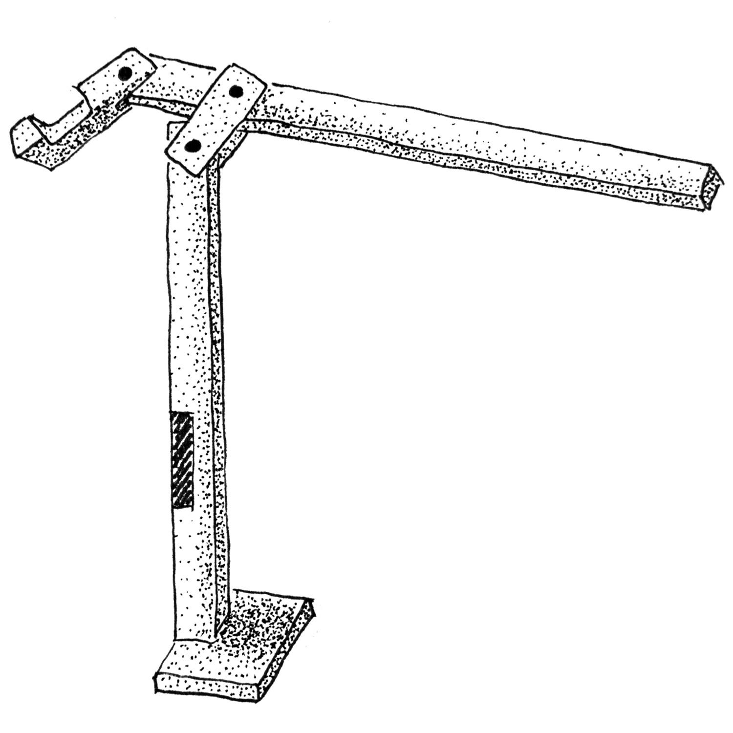
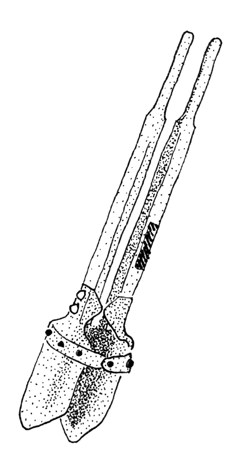
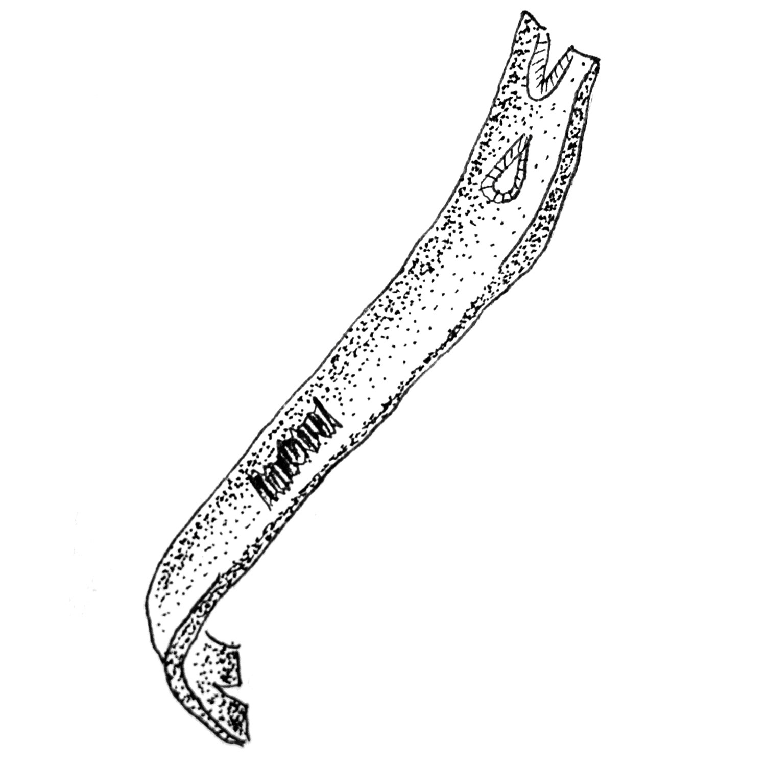
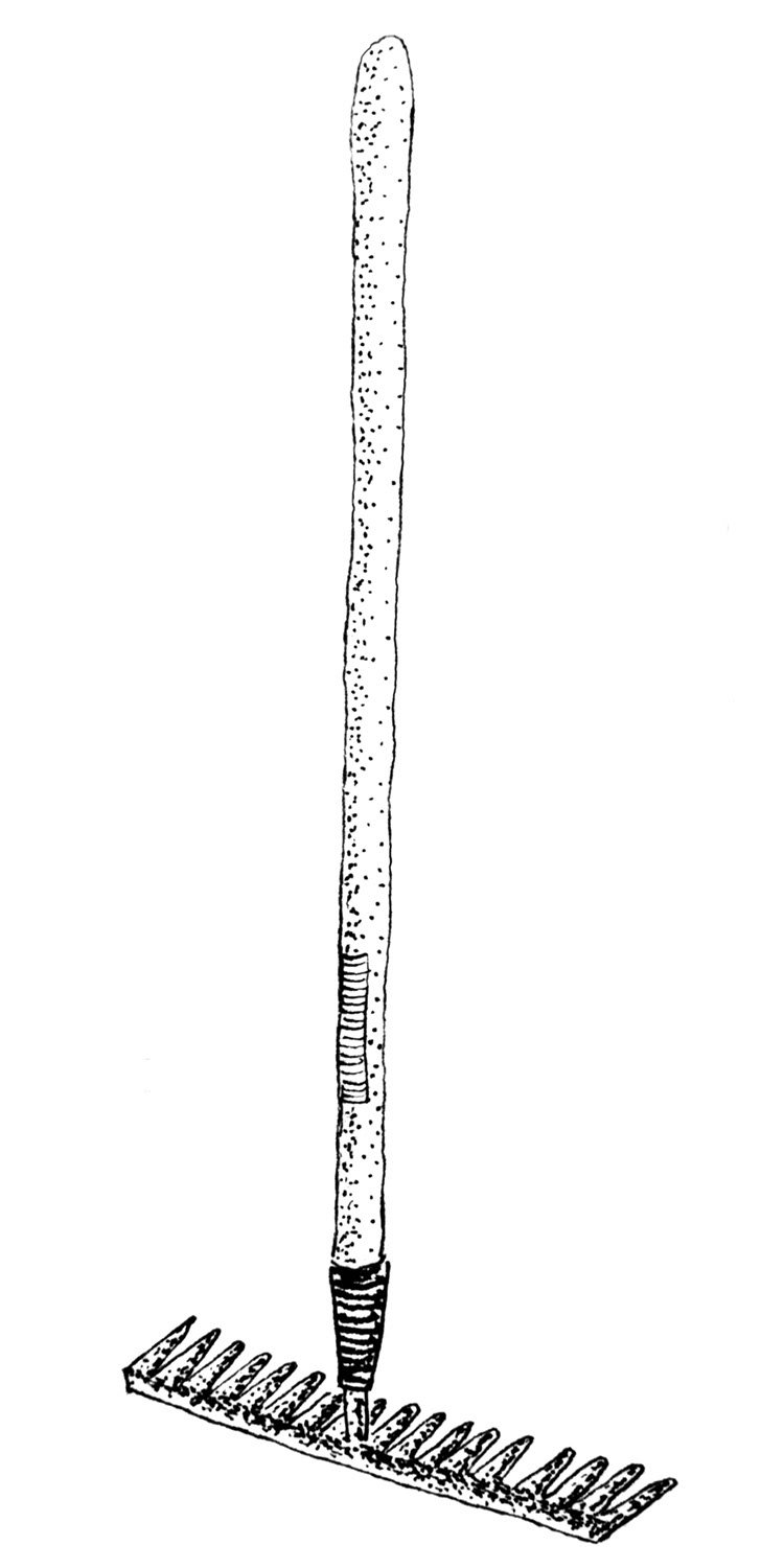
A Satisfying Solution
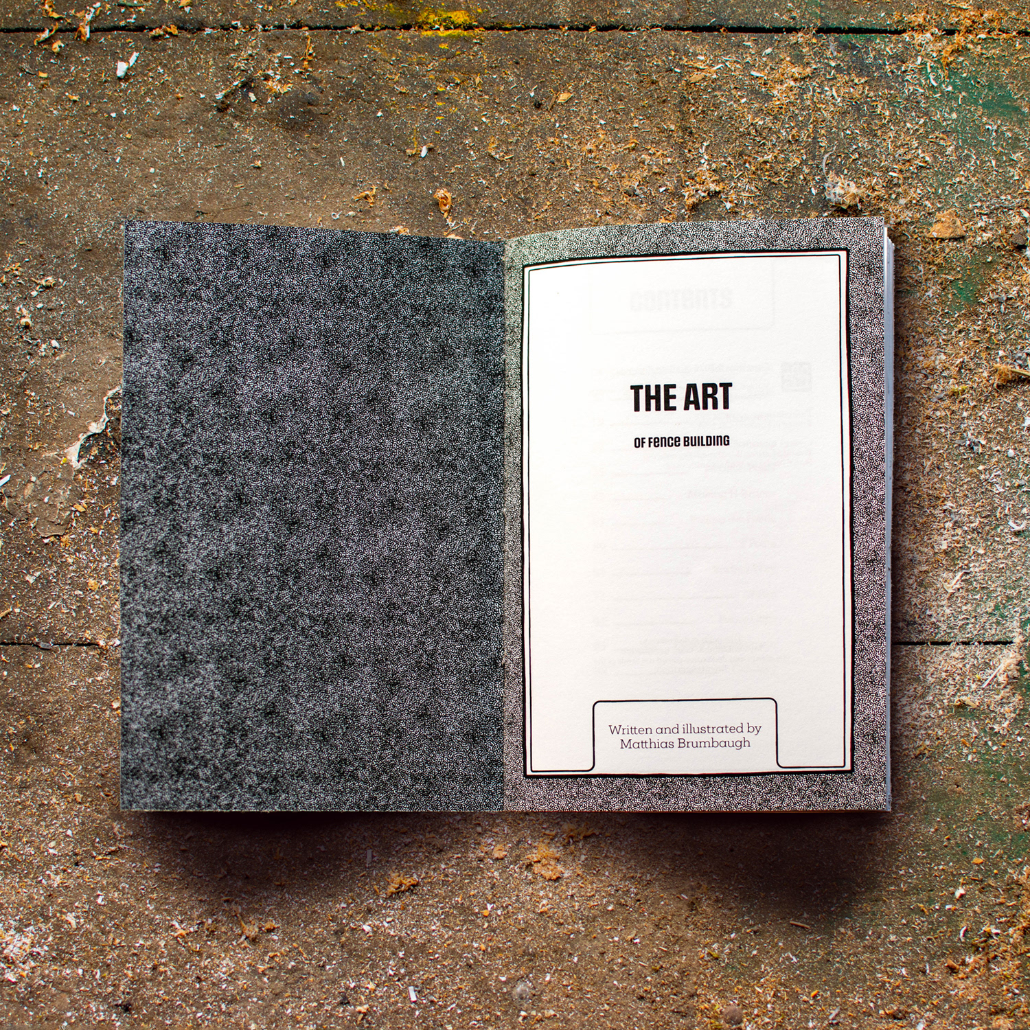
The final booklet is 88 pages broken into 13 sections. The Honest Handmade look and tone of the book plays into the rural aesthetic I aimed for without looking tacky. The border and chapter ornamentations were inspired by various farmers almanacs, with special attention to making the start of each chapter a calming break from the Information dense book.
I chose Mokoko light for the body copy and Social Gothic bold and medium for the headers and sub headers. Mokoko has a comfortable typewriter feel that contrasts nicely with the robust look of Social Gothic. The body copy was broken up into digestible chunks paired with the relevant imagery, and a hand drawn bullet character was incorporated to visually blend the various elements of the book.
