Posters for a Wholesome Church
I am excited to present a set of typographic posters I created for the Unitarian Universalist Church, a progressive religious organization that promotes social justice and inclusiveity. The challenge of this project was to visually communicate the church's core values of equality, compassion, and community, while maintaining a clean and modern aesthetic.
Using a combination of bold typography and minimalist design, I created a series of posters that celebrate diversity and unity. Each poster features a single word that embodies a core value of the church, such as "love," "justice," or "acceptance," set against a vibrant background color. The typography is clean and legible, with each word designed to stand out and grab the viewer's attention. The result is a powerful set of posters that not only communicate the church's values, but also serve as a call to action for viewers to join the movement towards a more just and equitable world.
The concept of this poster is to visually communicate the idea of interconnectedness and unity within humanity. The typography used in the poster has an organic appearance, resembling the natural flow and rhythm of human beings. The use of vibrant colors and fluid shapes adds to the overall sense of community and diversity.
The concept behind this poster is to visually communicate the church's belief in the inherent worth and dignity of every person, and the idea that a loving and compassionate God would not condemn anyone to eternal damnation. The warm color palette and use of Greek imagery creates a sense of serenity and balance, contrasting the traditional, wrathful depiction of God. The typography is bold and commanding, emphasizing the core message of the poster.
The concept behind this poster is to visually communicate the idea that in a vast and infinite universe, we are small and insignificant. The cool color palette and sharp, angular lines create a sense of detachment and coldness, contrasting the warm, inviting nature of the church's core values. The typography is clean and modern, with each word carefully placed to convey the message in a powerful and memorable way.
The concept behind this poster is to visually communicate the idea that imperfection is a natural part of the human experience, and that accepting and embracing our flaws is key to self-acceptance and personal growth. The typography is simple and clean, with the message presented in bold, sans-serif letters. The subtle embossing effect creates a tactile quality to the poster, contrasting with the raw, honest message. The use of irony in the design highlights the idea that society often promotes unrealistic ideals of perfection, and that embracing our flaws is a radical act of self-love.
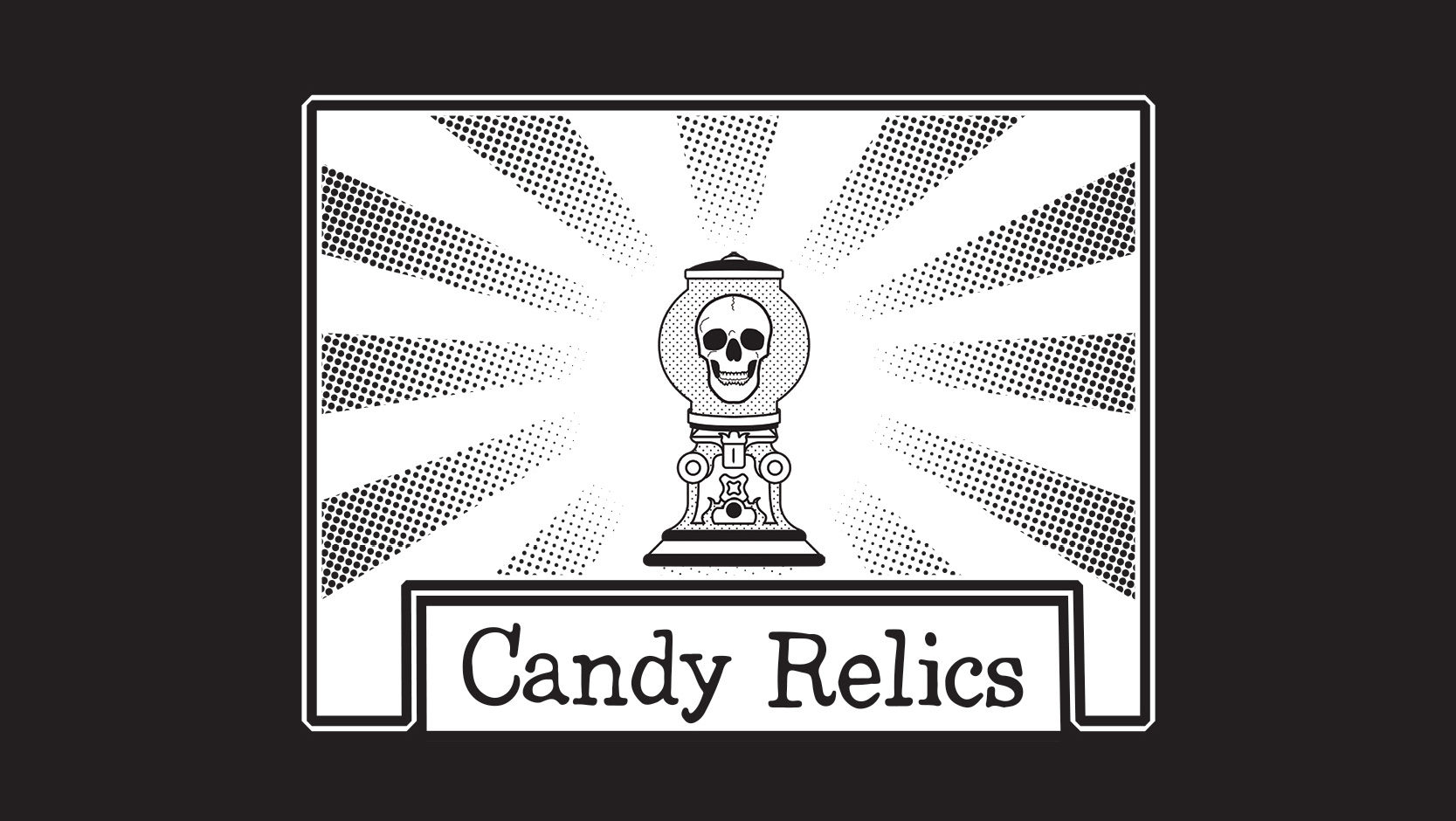
The concept behind this poster is to visually communicate the idea that in the face of mortality, all humans are equal, and there is no inherent hierarchy based on social status or wealth. The stippling effect adds visual interest to the typography, with the use of varying dot densities creating a sense of depth and texture. The imagery used in the poster contrasts technology with death, with the skull symbolizing the fragility of human life in contrast to the sleek, modern design.
The concept behind this poster is to visually communicate the idea that as human beings, we are all interconnected, and that our communities thrive when we support and uplift each other. The dingbat image used in the poster is a simple yet powerful symbol of community, with the various shapes representing individuals coming together as a collective whole. The overprint effect used in the design creates a retro, vintage feel, adding a touch of nostalgia to the message. The typography is clean and bold, with each word carefully placed to convey the message in a clear and memorable way.


